These Colors Will Rule 2022
- Feb 3, 2022
- 2 min read
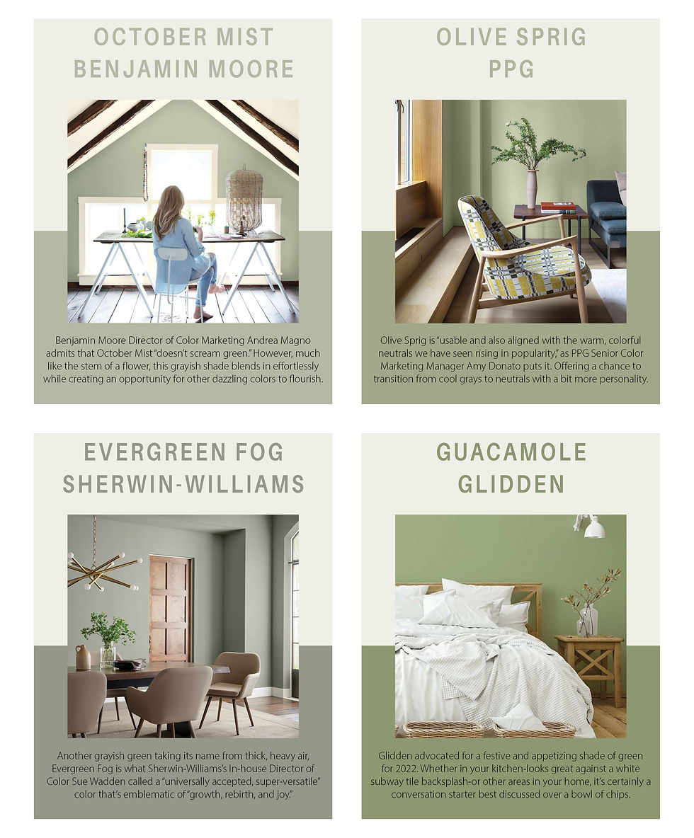
We’ve gathered a comprehensive rundown of the colors that companies like Behr and Sherwin-Williams, and more, predict will rule the year to come. It seems both companies, and others, are drawing inspiration from nature with these comforting hues.
Tell us which is your favorite at Hushh.club/about for a chance to win a free gift card to Sherwin-Williams!
Art and Craft by Dunn-Edwards

Though visually a departure from the parade of pale greens other brands chose to define 2022 trends, Art and Craft—a highlight of Dunn-Edwards’ Naturrensing palette—maintains a similar connection to the earth and an ability to offer something more than just the neutrals of the past.
“This is a versatile color we expect to see applied across a variety of industries and disciplines throughout 2022,” says Sarah McLean, Dunn-Edwards’s color expert and stylist, regarding this light and airy take on brown. “Art and Craft is truly a down-to-earth color that signifies stability, comfort, and calm.”

Bright Skies by Dulux

Fitting for a year where forecasters latched onto the idea of brighter days ahead, Dulux’s Bright Skies is an airy, open tone that can reinvigorate any room through the sense of freedom and possibility it offers. Honored as the brand’s color of the year by a team of international color and design experts, Bright Skies is a fun, yet functional, option that pushes the boundaries of a neutral without flying too close to the sun.
Breezeway by Behr

A silvery green suitable for everything from beachside vibes to modern, contemporary settings, Behr’s Breezeway “inspires us to fully embrace the hobbies or adventures, both near and far, that excite us,” says Erika Woeful, the company’s Vice President of Color and Creative Services. Breezeway functions as an intriguing and perfectly viable neutral for those ready to brighten a space by bringing the outdoors in.

Breathe by Graham & Brown

Not content to let earthier greens and browns have all the fun, Graham & Brown’s Breathe showed that the idea of connection to nature can draw inspiration from the sky as well. Fitting for a brand pushing to achieve carbon neutrality in 2022, the pale and powdery blue of Breathe also nods to wellness and sustainability. This shade works remarkably well when paired with Restore Midnight, Graham and Brown’s deep blue, naturally-inspired wallpaper of the year.


Very Peri by Pantone

Last, but certainly not least, industry leader Pantone announced its color of the year for 2022 in early December. The selection is a perfectly purple blue shade of periwinkle.
“For those who are gun-shy about using too much color and taking that first step, it’s a great color to use maybe just on one wall instead of all four walls,” says Leatrice Eiseman, Executive Director of the Pantone Color Institute, and it’s decidedly different from any pale or olive green. To read more about how Very Peri will reign this year, visit Very Peri is Very Now.


